The floor won
One observation from three design drafts
The trading-floor draft won the design of alwaysriskon.com because it looked like a trading screen and a business dashboard at the same time, which is the range of stories the site tells. It won against a broadsheet and an instrument panel built from the same brief.
Drafts3
The observation
On 26 September three design drafts for alwaysriskon.com went up side by side, a broadsheet, an instrument panel and a trading floor, all built from one brief. The floor won. It looked like a blend between a trading screen and a business dashboard, which is the kind of stories I tell, and the broadsheet and the instrument panel each looked like one of those things.
The number
Three drafts, and a little script shot each of them the same way, at phone and desktop width in both modes, so the choice was made on the same screens for each. Counting the floor’s second pass, which came after the choice, there are 207 screenshots in all.
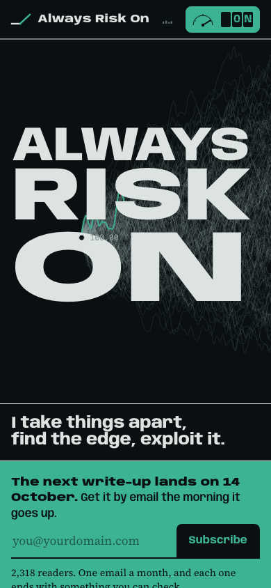
It was not the best draft on every count. The critique, by an independent AI critic, rated the broadsheet’s write-up page the easiest to read, and it failed the floor on disclosure, because the floor’s placeholder copy printed a figure the site’s rules never allow on an open project. The floor won anyway, on the one thing the others didn’t have. When you commit, the letters of the wordmark ride the surviving price path, so the type and the data become one object.
Why it matters
Not everything on this site is trading. A build log, a piece of research and an operating decision all have to sit on the same pages as a trade, and a pure trading screen would have made the build logs look borrowed. The floor fits all of them, because a dashboard already shows builds and businesses.
If you are choosing a design, build more than one draft from the same brief, shoot them all the same way and pick with them side by side. The readability gap was fixed in the second pass and the placeholder copy was thrown away, and neither would have been caught looking at one draft on its own.
How to check it
The page it became is the home page at alwaysriskon.com. Put it next to the phone screenshot above and the wordmark, the fan and the risk on switch are the same, and the placeholder copy is gone. The broadsheet and the instrument panel are parked and nothing on the live site uses them.
Check it yourself
- The page it became
- alwaysriskon.com